Difference between revisions of "Creating themes for Vortex"
Pickysaurus (talk | contribs) |
BinaryMisfit (talk | contribs) m (Added additional information for text-color-disabled) |
||
| (3 intermediate revisions by one other user not shown) | |||
| Line 1: | Line 1: | ||
Vortex comes with the ability to customise its appearance to suit you. Whether you want to improve the contrast of colours or just go for something whacky, you have the tools to make Vortex as unique as you like. You can also download [https://www.nexusmods.com/site/mods/27 some very basic themes here]. | Vortex comes with the ability to customise its appearance to suit you. Whether you want to improve the contrast of colours or just go for something whacky, you have the tools to make Vortex as unique as you like. You can also download [https://www.nexusmods.com/site/mods/27 some very basic themes here]. | ||
| − | + | | |
== Getting Started == | == Getting Started == | ||
| − | |||
| − | + | To get started, navigate to the “settings” section and select the “theme” tab. | |
| − | + | [[File:Themes1.JPG|800px|Themes1.JPG]] | |
| + | To make your first theme you want to clone the default, so you can start editing it. You will be asked for a name, this can be whatever you like. | ||
Now you will have unlocked the options to change the text and colours of Vortex for your new theme. The options presented to you will have the following effect on the style. | Now you will have unlocked the options to change the text and colours of Vortex for your new theme. The options presented to you will have the following effect on the style. | ||
== Font options == | == Font options == | ||
| − | [[File:Themes2.JPG | 800px]] | + | |
| + | [[File:Themes2.JPG|800px|Themes2.JPG]] | ||
{| class="wikitable" | {| class="wikitable" | ||
| − | |||
| − | |||
|- | |- | ||
| − | + | ! Option Name | |
| − | + | ! Elements changed | |
|- | |- | ||
| − | | | + | | Font Size |
| − | |This | + | | This is the global font size of Vortex. Think of it as a minimum size. Headings will always be slightly larger than the size set here (if possible). |
|- | |- | ||
| − | | | + | | Margins |
| − | |This | + | | This alters the spacing to the left and right of the text. A smaller number will put the borders closer to the text. |
|- | |- | ||
| − | |Font Family | + | | Font Family |
| − | |This option | + | | This option allows you to change the main font of vortex used in the text and side menu. |
|- | |- | ||
| + | | Font Family (Headings) | ||
| + | | This option changes the heading font, used mainly in tab headings. | ||
|} | |} | ||
| − | == Colour options == | + | == Colour options == |
| − | [[File:Themes3.JPG | 800px]] | + | |
| + | [[File:Themes3.JPG|800px|Themes3.JPG]] | ||
{| class="wikitable" | {| class="wikitable" | ||
| − | |||
| − | |||
|- | |- | ||
| − | + | ! Option Name | |
| − | + | ! Elements changed | |
| − | |||
| − | |||
| − | |||
| − | |||
| − | |||
| − | |||
|- | |- | ||
| − | |brand- | + | | brand-primary |
| − | | | + | | |
| − | * | + | *Buttons on theme page |
| − | * | + | *Number bubble for downloads/notifications |
| − | + | *Text on notification buttons | |
| + | *“Get more mods” button | ||
| + | *Expand/Collapse arrows on the dropzone | ||
| + | *Close button in error popup | ||
| + | |||
|- | |- | ||
| − | |brand- | + | | brand-info |
| − | | | + | | |
| − | *Background of | + | *Background of informational notifications |
| − | * | + | *Header icon in informational popup |
| − | + | *Background of certain dashlets | |
| − | *Background of | + | |
|- | |- | ||
| − | |brand- | + | | brand-bg |
| − | | | + | | |
| − | * | + | *Background of main Vortex window |
| − | * | + | *Background of the notification area |
| − | * | + | *Text area in error dialogues |
| − | * | + | *Background of drop-down menus |
| − | + | ||
|- | |- | ||
| − | | | + | | brand-clickable |
| − | | | + | | |
| − | * | + | *Buttons around the UI |
| − | * | + | *Menu active section label |
| + | *Menu collapse/expand button | ||
| + | *Download graph line | ||
| + | *Toolbar background | ||
| + | *Log out button on Nexus Mods account dashlet. | ||
| + | |||
|- | |- | ||
| − | | | + | | link-color |
| − | | | + | | |
| + | *Text-based links | ||
| + | *Unresolved conflicts icon | ||
| + | |||
|- | |- | ||
| − | |brand- | + | | brand-highlight |
| − | | | + | | ''Not currently used.'' |
| − | |||
| − | |||
|- | |- | ||
| − | |brand- | + | | brand-warning |
| − | | | + | | |
| − | *Background of | + | *Background of warning notifications (e.g. "There are unsolved file conflicts.") |
| − | * | + | *Missing masters icon on the plugins page. |
| − | + | ||
|- | |- | ||
| − | | | + | | brand-menu |
| − | | | + | | |
| − | * | + | *Background of the content area. |
| − | * | + | *Background of the side menu. |
| − | * | + | *Background of pop-up windows (such as when managing conflicts). |
| + | |||
|- | |- | ||
| − | | | + | | text-color |
| − | | | + | | |
| − | * | + | *Primary text colour. |
| − | * | + | *Header text in inactive tabs. |
| − | * | + | *Switch for "dark theme" on themes page. |
| − | + | ||
|- | |- | ||
| − | |brand- | + | | brand-success |
| − | | | + | | |
| − | *Background of | + | *Background of success notifications (check for mod updates complete). |
| − | * | + | *Enabled button on mods and plugins pages. |
| − | * | + | *On/Off settings toggles (when on) |
| + | *File conflict rules set icon (lightning bolt). | ||
| + | |||
|- | |- | ||
| − | |brand- | + | | brand-danger |
| − | | | + | | |
| + | *Background of error notifications. | ||
| + | *Uninstall button. | ||
| + | *Header icon in error pop-up boxes. | ||
| + | |||
|- | |- | ||
| − | | | + | | brand-secondary |
| − | | | + | | ''Not currently used.'' |
| − | |||
|- | |- | ||
| + | | text-color-disabled | ||
| + | | | ||
| + | *Text in tabs that have no content to display ("Nothing to configure" in workarounds). | ||
| + | *Arrow lines in the Manage Groups editor | ||
| + | |||
|} | |} | ||
=== Dark Theme === | === Dark Theme === | ||
| + | |||
Vortex has 6 different shades of grey used on its master stylesheet. These can by default set to improve visibility on a light theme. Checking this box will reverse the way the grey colours are used (making the lightest grey the darkest and vice versa). If you are making a dark theme, turning this on will improve contrast and readability of the UI elements. | Vortex has 6 different shades of grey used on its master stylesheet. These can by default set to improve visibility on a light theme. Checking this box will reverse the way the grey colours are used (making the lightest grey the darkest and vice versa). If you are making a dark theme, turning this on will improve contrast and readability of the UI elements. | ||
== Elements not changed by colour selection == | == Elements not changed by colour selection == | ||
| + | |||
As of Vortex 0.16.8, the following elements are not styled and will not obey theme colours above. | As of Vortex 0.16.8, the following elements are not styled and will not obey theme colours above. | ||
| − | *Header of the currently active tab. | + | *Header of the currently active tab. |
| − | *Right-click menu mouse-over colour | + | *Right-click menu mouse-over colour |
| − | *Folder icon in the dropzone. | + | *Folder icon in the dropzone. |
| − | *Font size sliders on themes page. | + | *Font size sliders on themes page. |
| − | *Download graph gradient fill. | + | *Download graph gradient fill. |
== Edit CSS Manually == | == Edit CSS Manually == | ||
| − | |||
| − | [[Category: Vortex]] | + | Vortex also has an option for you to insert your own CSS manually. When using this option, it is recommended to use the [https://www.nexusmods.com/site/mods/12 developer tools] which enable the console. You can add custom styles for any pre-determined classes in Vortex. |
| + | |||
| + | [[Category:Vortex]] [[Category:User Interface]] | ||
Latest revision as of 11:56, 22 April 2020
Vortex comes with the ability to customise its appearance to suit you. Whether you want to improve the contrast of colours or just go for something whacky, you have the tools to make Vortex as unique as you like. You can also download some very basic themes here.
Contents
Getting Started
To get started, navigate to the “settings” section and select the “theme” tab.
To make your first theme you want to clone the default, so you can start editing it. You will be asked for a name, this can be whatever you like.
Now you will have unlocked the options to change the text and colours of Vortex for your new theme. The options presented to you will have the following effect on the style.
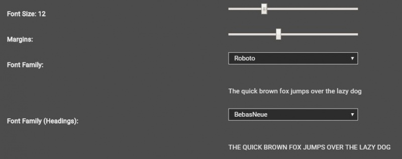
Font options
| Option Name | Elements changed |
|---|---|
| Font Size | This is the global font size of Vortex. Think of it as a minimum size. Headings will always be slightly larger than the size set here (if possible). |
| Margins | This alters the spacing to the left and right of the text. A smaller number will put the borders closer to the text. |
| Font Family | This option allows you to change the main font of vortex used in the text and side menu. |
| Font Family (Headings) | This option changes the heading font, used mainly in tab headings. |
Colour options
| Option Name | Elements changed |
|---|---|
| brand-primary |
|
| brand-info |
|
| brand-bg |
|
| brand-clickable |
|
| link-color |
|
| brand-highlight | Not currently used. |
| brand-warning |
|
| brand-menu |
|
| text-color |
|
| brand-success |
|
| brand-danger |
|
| brand-secondary | Not currently used. |
| text-color-disabled |
|
Dark Theme
Vortex has 6 different shades of grey used on its master stylesheet. These can by default set to improve visibility on a light theme. Checking this box will reverse the way the grey colours are used (making the lightest grey the darkest and vice versa). If you are making a dark theme, turning this on will improve contrast and readability of the UI elements.
Elements not changed by colour selection
As of Vortex 0.16.8, the following elements are not styled and will not obey theme colours above.
- Header of the currently active tab.
- Right-click menu mouse-over colour
- Folder icon in the dropzone.
- Font size sliders on themes page.
- Download graph gradient fill.
Edit CSS Manually
Vortex also has an option for you to insert your own CSS manually. When using this option, it is recommended to use the developer tools which enable the console. You can add custom styles for any pre-determined classes in Vortex.


